Get Color
Version: 1.0.14
3.90MB
4.2
Get Color is a compact visual toolkit for exploring, selecting and organizing colors for design, art and fashion. Get Color places a broad spectrum of hues, named swatches and coordinated palettes within a simple interface so you can quickly test combinations, read color values in HEX/RGB, and collect reference palettes for projects. The app works as both a practical color reference and a low-pressure learning space for people who want faster palette decisions and clearer color intuition.
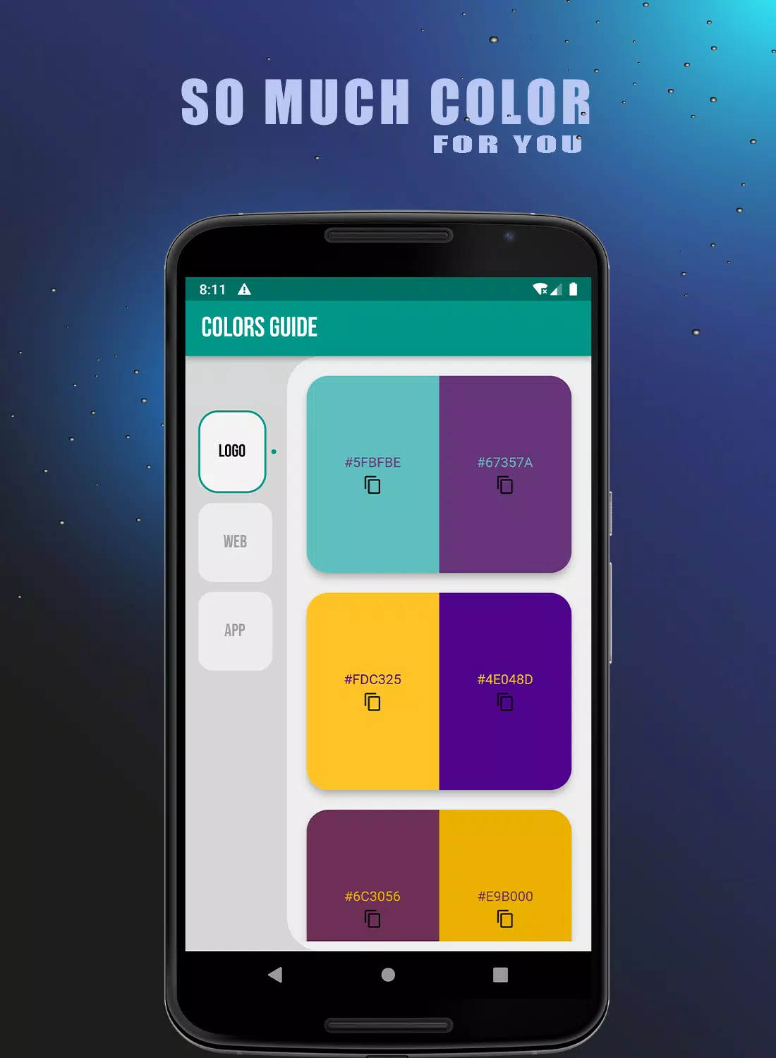
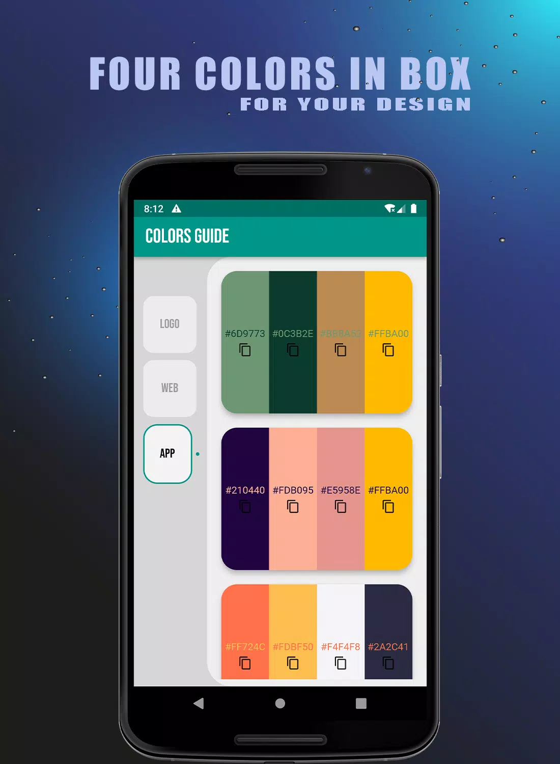
The main view in Get Color presents a scrollable spectrum of color swatches and grouped palettes that you can inspect at a glance. Tap any swatch to reveal technical values and contextual examples, then use the app’s picker to fine-tune shade, saturation and brightness. Built-in gradient previews show how two or more tones interact across common UI, print, and textile-like mockups. The interface emphasizes visuals over dense text so you can make decisions by eye while still accessing precise numeric color codes when needed.
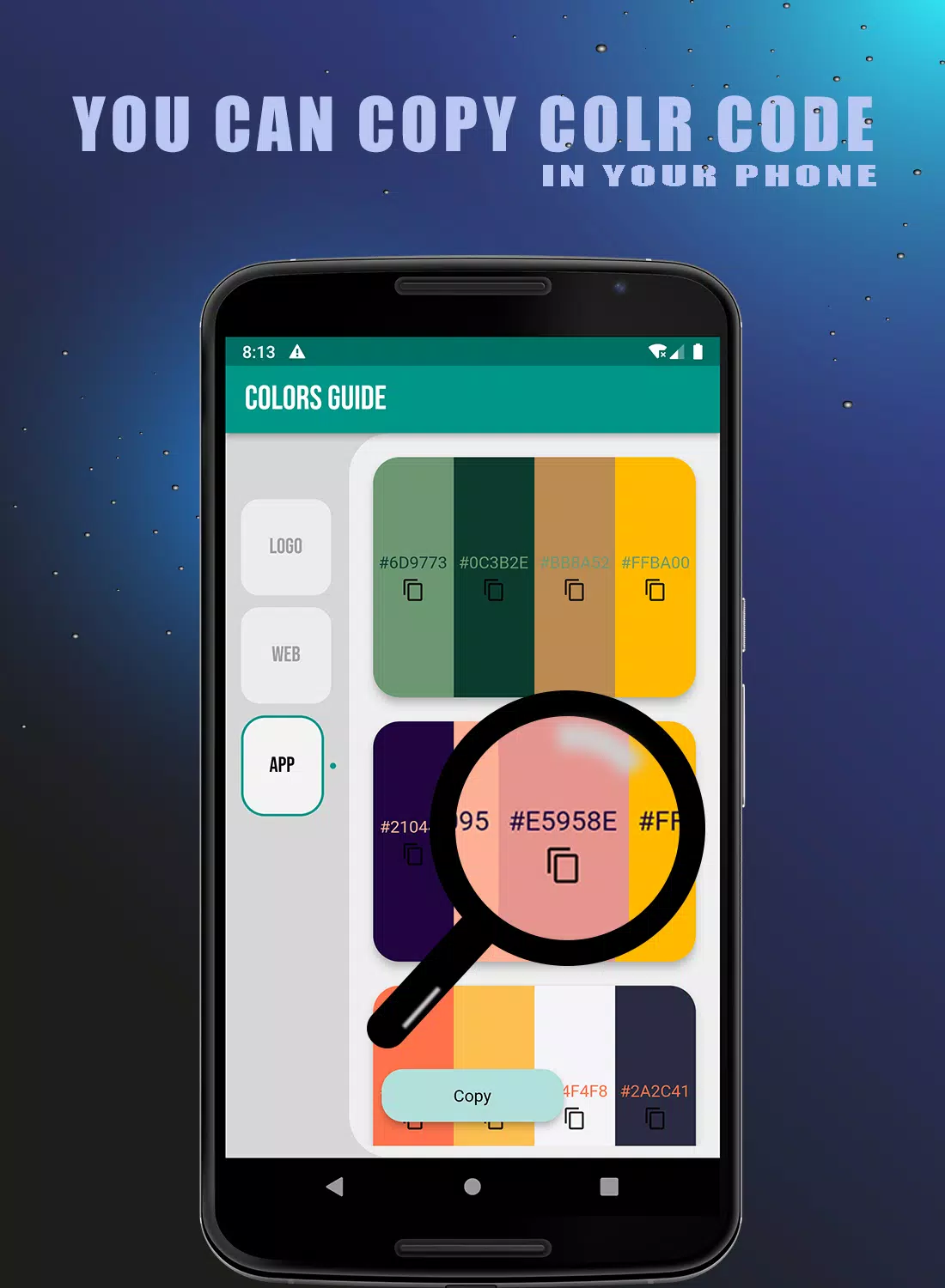
Controls are deliberately straightforward: touch to select, drag to compare adjacent swatches, pinch to zoom into palette detail, and long-press to save a color to a custom set. Color adjustments use sliders for hue, saturation and value, and a numeric entry option allows exact HEX or RGB values for designers working with external tools. The app supports copy-to-clipboard for color codes, making it easy to paste values into design apps or use them when communicating with printers and manufacturers.
Get Color integrates a gentle progression system that encourages learning rather than forcing levels. As you explore, optional short tutorials and practice exercises unlock, covering fundamentals of contrast, complementary harmony and accessible contrast ratios. The app tracks which topics you have sampled and suggests follow-up examples and palette adjustments, so over time you build a small personal reference library. These learning elements are offline-friendly and focus on visual examples and brief explanations rather than long lessons.
Saved palettes are organized into user-created collections named for projects, seasons or client briefs, and each collection can include notes for context or usage suggestions. You can reorder swatches, annotate palettes with intended use cases, and export palettes as common color formats for use in other design tools. Customization also extends to display preferences: switch between large swatches for quick visual scanning or compact lists for technical review.
The app uses a minimal, neutral interface so colors remain the focal point. Mockup previews include simple UI components, fabric textures and flat print layouts to demonstrate how palettes behave in different contexts. These previews help you evaluate contrast, legibility and overall harmony without needing additional design software. The visuals are optimized for clarity on different screen sizes and maintain consistent color rendering across typical mobile displays.
Replay value in Get Color comes from iterative experimentation and timed practice modes designed to sharpen color judgment. Optional challenges ask you to match or recreate palettes based on a prompt, compare contrast choices under accessibility constraints, or assemble palettes around a given theme. These tasks are brief and repeatable, offering both casual practice and a way to test different approaches to composition and harmony.
Accessibility features include readable font sizes for labels, high-contrast display modes, and clear visual indicators for focus and selection. Most content is available offline so you can access saved palettes and learning modules without a network connection; large databases load incrementally to preserve performance on older devices. The app emphasizes responsive touch controls and low-latency color sampling for a smooth, reliable experience across a wide range of phones and tablets.
Get Color is designed for quick reference, inspiration and education rather than color-critical production work that requires hardware calibration or specialized output profiles. It suits designers, illustrators, stylists, makers and hobbyists who need to assemble palettes, test combinations, and maintain a portable color library. If you require print-proof color matching for press runs, professional color-management tools and calibrated displays remain the recommended complement.